
24 Successful Instagram ads: examples by format (2026)
TABLE OF CONTENTS

TL;DR
✅ The best Instagram ads in 2026 are built for a specific placement, not resized into it. Stories ads need a single message and a thumb-stop in the first second. Reels ads need motion and a hook in three seconds. Feed ads can carry more detail. We pulled 24 successful Instagram ads across all four formats, including Revolve's Stories campaign that drove 9x ROAS and 471% more purchases. ⚠️ The ads that fail are usually feed creative dropped into a Stories slot unchanged.
What makes an Instagram ad successful?
A successful Instagram ad is one that matches its placement's viewing behaviour: it earns attention in the first second, delivers one clear message rather than several, and gives the viewer a single obvious action to take. Format fit matters more than production budget, which is why phone-shot Stories ads routinely beat polished studio work.
That definition is doing more work than it looks. Most advertisers still build one creative asset and push it into every placement, then wonder why Stories underperforms. The placements are not interchangeable. Someone tapping through Stories is moving fast and holding their thumb over the screen. Someone scrolling Reels expects motion and sound. Someone in the main feed has already slowed down.
Beyond format fit, the ads below share five things:
- One message, not three. The strongest ads here could be described in a single sentence.
- Native feel. They look like they belong on the platform rather than like a banner that wandered in.
- A specific call to action. "Shop the sale" beats "learn more" almost every time.
- Visual hierarchy that survives a small screen. If it only reads on desktop, it does not read.
- Brand consistency. Colour, type and tone that match what the viewer lands on after the tap. If your Instagram colour palette shifts between ad and landing page, the tap feels like a mistake.
👉 Bottom line: format fit first, message discipline second, everything else after that.
Instagram ad performance benchmarks by format
Before the examples, here is what each placement actually delivers. These are 2026 benchmark medians drawn from Meta advertising benchmark data, and they explain why the format-specific approach below matters.
The shift worth acting on: Reels rose from 19% of Instagram ad impressions in Q1 2025 to 33% in Q1 2026, while feed dropped to 26% (Tinuiti Q1 2026 Digital Ads Benchmark Report). Feed is no longer the default placement on Instagram. If your creative library is still feed-first, it is aimed at the smallest of the three surfaces.
Instagram Stories ad examples
Stories ads are full-screen vertical placements that run between organic Stories, at 1080x1920 and a 9:16 ratio. You get one to fifteen seconds and a viewer whose thumb is already moving. The ads that work here strip everything down to one visual, one line and one action.
1. Revolve: template systems that scaled Stories output
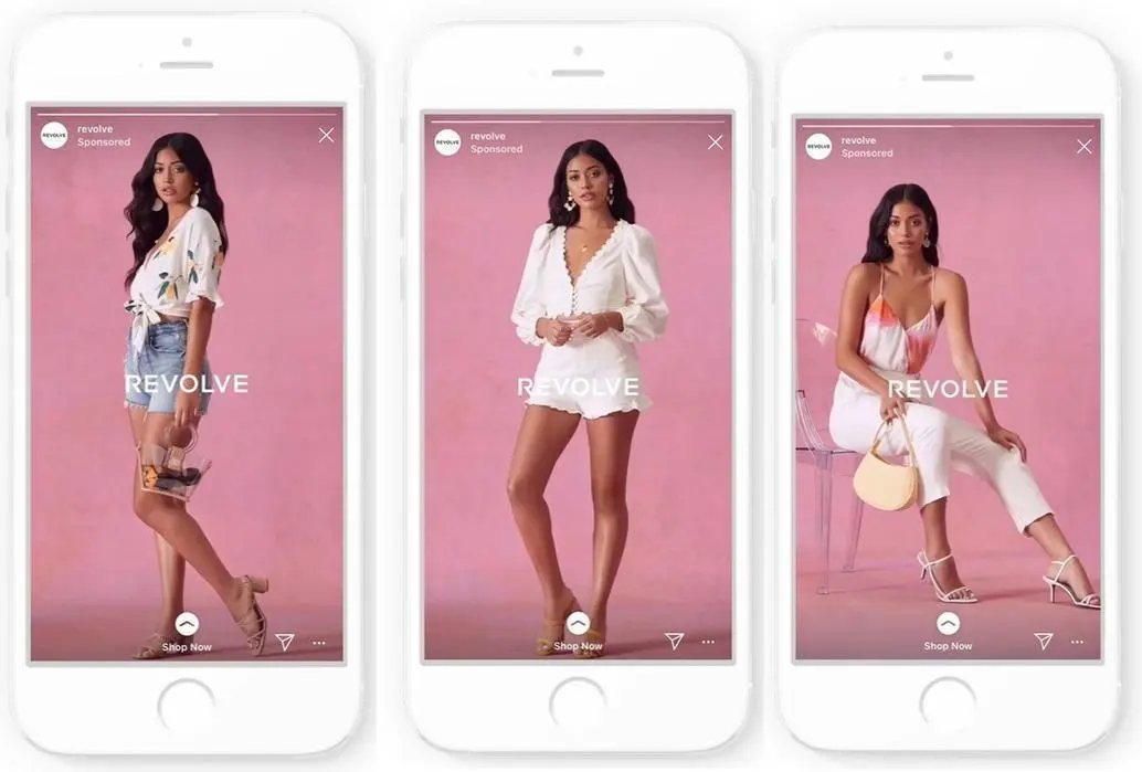
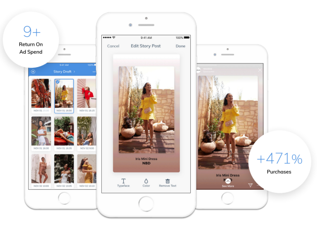
Result: 9x ROAS and 471% more purchases on average (Dash Social case study)
The fashion retailer's paid social team had a volume problem, not a creative one. They needed on-brand Stories ads faster than a designer could build them one at a time. Working with Dash Social's Story Studio, they moved to a template system that turned their best owned and earned content into Stories ads quickly, including layouts that pair an editorial shot with a product image in the same frame.
The lesson is not "use templates." It is that Stories performance is partly a throughput problem. Revolve's lift came from being able to test far more variations, not from one brilliant ad. Most brands run three Stories creatives a quarter and conclude the placement does not work for them.
2. Zara: dynamic ads that assemble themselves
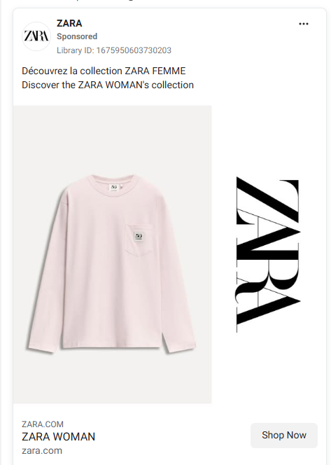
Zara runs Dynamic Ads that pull individual products from its catalogue and generate minimalist Stories automatically, one item per frame with a single clear CTA. Tapping "Expand story" reveals more product showcases inside the same ad unit.
What makes this work is restraint. There is no headline competing with the product, no badge, no urgency bar. For a brand with a huge catalogue and a recognisable visual language, automated personalisation still feels curated because the template refuses to add anything.
3. Revolut: one line, one product, one tap
Revolut's Stories ad shows the card in motion against bold typography and the line "See it. To believe it." That is the entire ad. No feature list, no rate comparison, no small print.
Fintech ads usually overexplain because the product is abstract. Revolut goes the other way and sells the object. For a category where most competitors lead with APY figures nobody reads at a full-screen tap, confidence reads as differentiation.
4. Kate Farms: a headline that carries the whole ad

This Kate Farms Stories ad grabs attention through copy rather than visual complexity. The headline captures the brand's mission and moves the eye from the top of the frame to the CTA at the bottom without any decorative help.
Worth noting for anyone working with limited creative budget: this ad would work as a flat colour background with well-set type. The hierarchy is the design.
5. Eubi: the product demo as Stories ad
Eubi's chino shorts get stretched, pulled and twisted out of shape, then snap back intact. It is a product demo compressed into a few seconds of vertical video.
Demo content is underused in Stories because brands assume the format is too short. It is not. If your product does one visually obvious thing, Stories is arguably the best placement you have. The stretch test needs no sound, no text and no explanation.
6. Domestika: instructor name, course name, CTA

Domestika's Stories ad lists the instructor, names the course and adds a call to action. There is no flourish and no atmospheric copy.
This works because of audience qualification. Only someone who wants that course from that instructor taps through, which keeps the click quality high. Plenty of advertisers would call this ad underdesigned. The clicks it does generate are worth more than a broader creative would produce.
Instagram Reels ad examples
Reels ads sit between organic Reels in a full-screen vertical feed built for speed and discovery. They now carry the largest share of Instagram ad impressions, and they are the cheapest placement on CPM. The bar is the first three seconds.
7. Uber: user-generated content that people forward
Nothing about this looks produced, which is the point. UGC-style testimonial video is consistently among the strongest performing Reels formats, and the reason is that it does not trip the viewer's ad-recognition reflex in the first second. Polished brand film does.
8. Visa: a narrative arc in a few seconds
As a Winter Olympics partner, Visa built a Reels ad that follows a fast payment through to the reward of attending the Games, with dynamic transitions connecting sporting moments to everyday shopping.
Most brand-sponsorship creative just places a logo next to an event. Visa built a small story where the product is the mechanism that connects the two. That is a harder brief and a better ad.
9. Coursera: a static image that earns its Reels slot
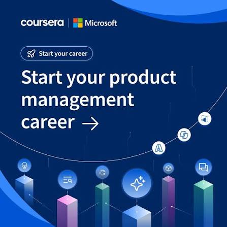
Coursera's ad for its AI Product Manager certificate, built with Microsoft, is a still: structured layout, crisp type, deep blue tech background, and a strong CTA "Start your product management career."
This is a useful counterexample. Reels rewards motion, and motion-led creative generally outperforms in the placement, but a static ad with a concrete, time-bound claim can still convert. The claim is doing the work that movement usually does.
Instagram carousel ad examples
Carousel ads hold up to ten swipeable images or videos, each with its own link. They suit multi-product ranges and any message that benefits from sequence. The failure mode is treating all ten cards as equally important.
10. Expedia: destinations as a swipeable list
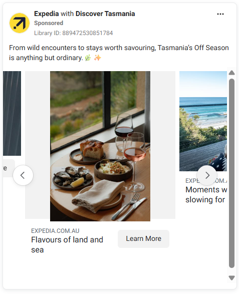
For its Unpack '26 campaign, Expedia built a carousel around ten destinations predicted to gain traction, each panel pairing sharp photography with simple typographic labels and a "Learn More" CTA.
The listicle structure is why it works. Viewers know how many cards there are and what each one contains, so swiping feels like browsing rather than being sold to.
11. Scarters: showing the benefit, not the product

Scarters uses its carousel to show how much desk space one of its mats clears. The brand is built on minimalism and the ad demonstrates that rather than claiming it.
Note what is absent: no lifestyle shot of a person, no brand story card. Each frame shows a desk. For a product whose entire value is visual before-and-after, that discipline is right.
12. Kizik: let the range do the talking

Kizik's carousel lets shoppers swipe through multiple products across colours and around twenty styles, with short copy throughout.
The copy restraint is deliberate. When the product range is the offer, adding a persuasive headline to each card slows the swipe down. Kizik gets out of the way.
13. Oats Overnight: colour as the sorting mechanism
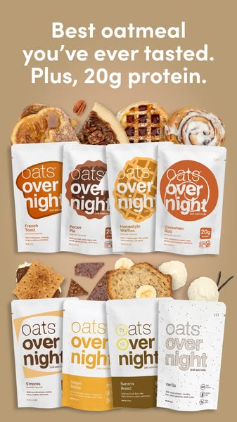
This carousel runs through twenty flavours, each with its own attention-grabbing palette that makes the product look more appetising.
Variety-pack products have a specific advantage in carousel: the format matches the shopping behaviour. People genuinely want to see all the flavours. Few product categories can say the same, which is why so many carousels feel padded.
14. Ugaoo: the same product, six ways
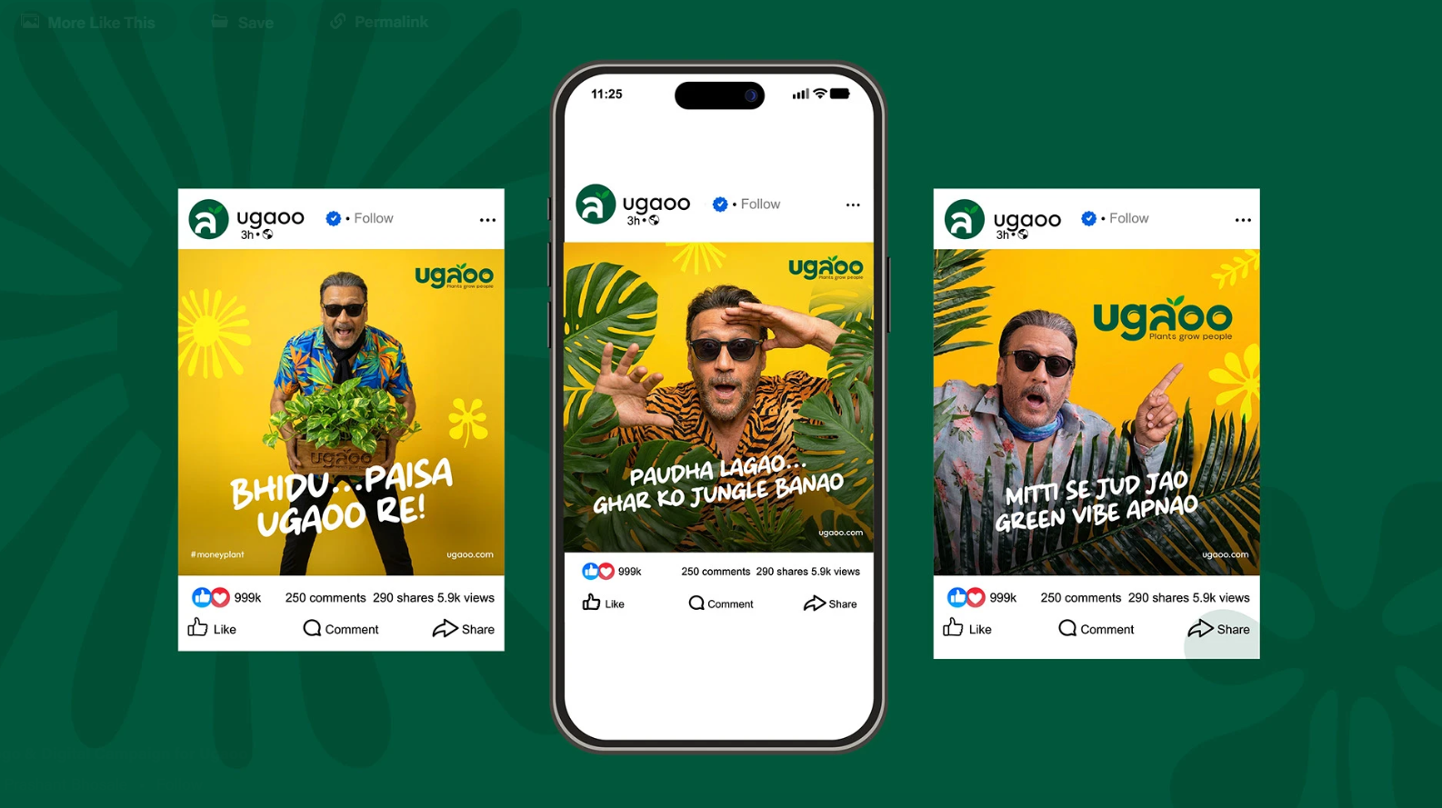
Ugaoo, an online plant retailer in India, uses carousel frames to show different plant setups, each with a different plant in focus.
This solves a real problem for home and decor brands: a plant on a white background tells you nothing about scale or how it will look in a room. Six settings answer the objection before it forms.
Instagram video ad examples
Video ads in the main feed have more room than Stories or Reels but less inherent attention than either. They need to earn the stop.
15. Tropicfeel: a headline the video proves
"The sneaker you can swim in," and then the ad shows exactly that, against scenery worth watching on its own.
Claim plus immediate proof is the most reliable video ad structure there is. The scenery is a bonus, not the mechanism.
16. Mountain Equipment Coop: opening on momentum
MEC opens with "Hiking season isn't over" and builds a short narrative of hikers in strong scenery.
The opening line is doing something specific: it answers an objection the viewer has not consciously formed yet. Seasonal outdoor brands lose the back half of the year to the assumption that the season has ended, and MEC leads with the rebuttal.
17. Intercom: a still image that moves
Intercom's ad is essentially a photograph with text rolling on and off the frame. Most of the screen never changes.
For B2B teams without video budget, this is the most useful example in the article. Minimal motion against a static frame still qualifies as video for placement purposes, and it can be produced in an afternoon.
Instagram feed and image ad examples
Static feed ads are the oldest format on the list and still the most detail-tolerant. The constraint is that they compete with organic content from people the viewer actually chose to follow.
18. Wix: colour contrast as the stopping mechanism
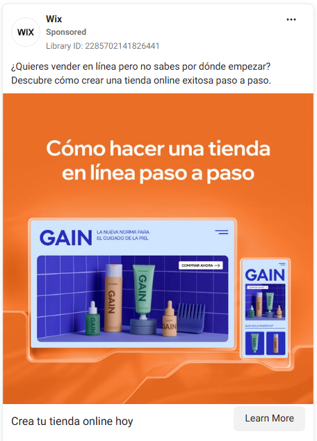
Dark navy against tangerine orange, with bold, simple wording. That combination is what makes it register mid-scroll.
High-contrast complementary pairs work because the feed around them is mostly photography in mid-tones. The ad is not louder, it is differently coloured.
19. Hostinger Global: one theme, carried all the way through

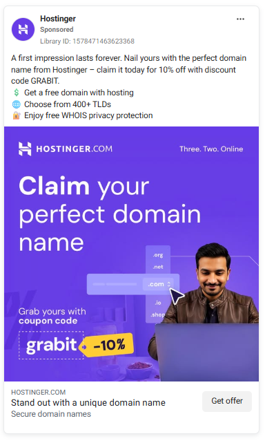
Hostinger's ad commits fully to a launch and mission concept, with an astronaut, bold colour and the tagline "Three. Two. Online."
Thematic consistency between visual, copy and tagline is rarer than it should be. Most ads pick a metaphor for the headline and ignore it in the art direction.
20. Colgate: a question that creates a small itch

Colgate opens with a question about whiter teeth, in the brand's recognisable red.
Question-led ads work when the question is one the viewer has actually asked themselves. They fail when the question is manufactured to set up the product. This one is on the right side of that line.
21. IconScout: proving versatility in one frame
IconScout shows the same icons rendered in six different styles, laid out in a grid.
For any product where the value is range rather than a single item, this "same thing, many ways" grid is the most efficient possible ad. It answers "will this fit my brand" instantly.
22. Shopify: building the ad around one word

Shopify's ad is constructed so that the turquoise "free" sits near the centre and reads before anything else, with a website wireframe showing what you get.
The colour placement is not decorative. The layout is engineered so the highest-value word in the ad is the first thing the eye lands on.
Instagram shoppable and collection ad examples
Shoppable and collection ads let people browse and buy without leaving Instagram, which removes the biggest drop-off point in the funnel.
23. Walmart: timing plus shoppability

This Walmart shoppable ad ran around Father's Day, letting viewers tap an item and go straight to purchase.
The seasonal timing matters as much as the format. Shoppable ads convert best when the viewer already has a purchase occasion in mind and just needs the path shortened.
24. McDonald's: a merchandise catalogue in an ad unit

McDonald's used a collection ad to display apparel and merchandise with prices and product names under each item, browsable and purchasable directly.
Most people do not know McDonald's sells clothes, and that surprise is the ad's actual hook. The collection format then handles the browsing that surprise generates.
What ads work best on Instagram?
Reels ads deliver the best cost efficiency in 2026, with the highest CTR of the three placements, a median 3.12x ROAS and CPMs 30 to 50% below feed. Stories deliver the cheapest clicks. Feed remains the most expensive placement but holds up for considered, detail-heavy purchases. The right answer depends on where the purchase decision sits.
Three patterns hold across every example above:
Format-native beats format-agnostic. Every ad that performed well here was built for its placement. This is the single most common failure we see in ad requests: one square asset, submitted for use everywhere.
Simple beats comprehensive. The ads that tried to communicate one thing outperformed the ads that tried to communicate three. This is harder than it sounds, because internally there are always three things everyone wants included.
Native beats polished, at least in Stories and Reels. Uber's selfie-style driver ad and Revolve's template-built Stories are both, in different ways, less produced than a brand film. Both outperformed.
How to design an Instagram ad that converts
Start from the placement and work backwards. Decide where the ad will run, then build for that shape, that attention span and that viewing context. Design one asset per placement rather than resizing a single master file, because a centred square composition loses its focal point when cropped to 9:16. The same discipline applies to organic work, and our guide to creating stronger Instagram content covers the overlap. If you are running ads on more than one network, the underlying principle carries across to social media graphics generally.
Then produce enough variations to actually learn something. Revolve's results came from volume of testing, not one hero asset. Most teams stall here, because three variations per campaign is a design capacity problem, not a strategy problem.
That capacity gap is what a design subscription solves. At ManyPixels, a typical daily output is 2-3 social media graphics or 2-3 display ads, delivered every business day, which is roughly the cadence a real Instagram testing programme needs.
💰 Plans start at $699/mo for the Advanced plan, with unlimited requests and unlimited revisions across all tiers. Notably, 72% of customers choose the Assigned Designer or Design Team plans, where you pick your designer and work with them over Slack, because ad creative benefits from someone who knows the brand rather than a rotating queue.
Beth Shepherd, Marketing Manager @ Virtual Service Operations, put it this way:
ManyPixels has been a game-changer for our marketing team. They've quickly understood our brand and hit the ground running, producing everything from brand and website graphics to social media assets and video editing. Their turnaround time is impressive, and they're incredibly responsive. It never feels like we're waiting on creative support. They feel like an extension of our internal team.
👉 See how ManyPixels handles ad creative or explore ManyPixels plans.
Frequently asked questions
The bottom line
✅ The most useful pattern across these 24 successful Instagram ads is that none of them were built to run everywhere. Stories ads got Stories treatment, Reels got motion and a three-second hook, feed ads got the detail they could afford to carry. 🚀 With Reels now taking a third of Instagram ad impressions and feed down to roughly a quarter, a feed-first creative library is aimed at the wrong surface.
If your bottleneck is producing enough format-specific variations to test properly, that is a capacity problem rather than a creative one, and it is worth solving before spending more on media.
{{SOCIAL_BANNER="/dev/components"}}
Got a campaign you are trying to get off the ground? We design Instagram ad creative every day and we are happy to tell you which format we would use.

Zach is a content and SEO strategist with an affinity for cars, tech, and animals. He runs a SaaS content agency, and when he's not typing, he runs his small-scale farm at home.

Top-quality designers
A complete creative team at your fingertips: graphic and web designers, illustrators, and more.

Lightning-fast turnaround
Get start today and receive your first update on the next business day.

All-inclusive pricing
Unlimited requests and revisions. One flat monthly fee. No surprises.

Flexible & scalable model
No contract. Scale up and down as needed. Pause or cancel at anytime.
Continue reading


.jpeg)
Explore some of our best designs
Get inspired by a curated selection of ManyPixels work. Download the portfolio to see what our team can create.








